Skip to product information
1 of 2

Chequeered Pride Flag | 2-Layer Screen Print Rainbow Roll | Upcycled Fabric

Chequeered Pride Flag | 2-Layer Screen Print Rainbow Roll | Upcycled Fabric

Regular price $24.00
Regular price Sale price $24.00
Sale Sold out
Shipping calculated at checkout.

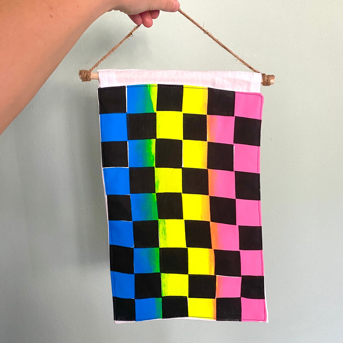
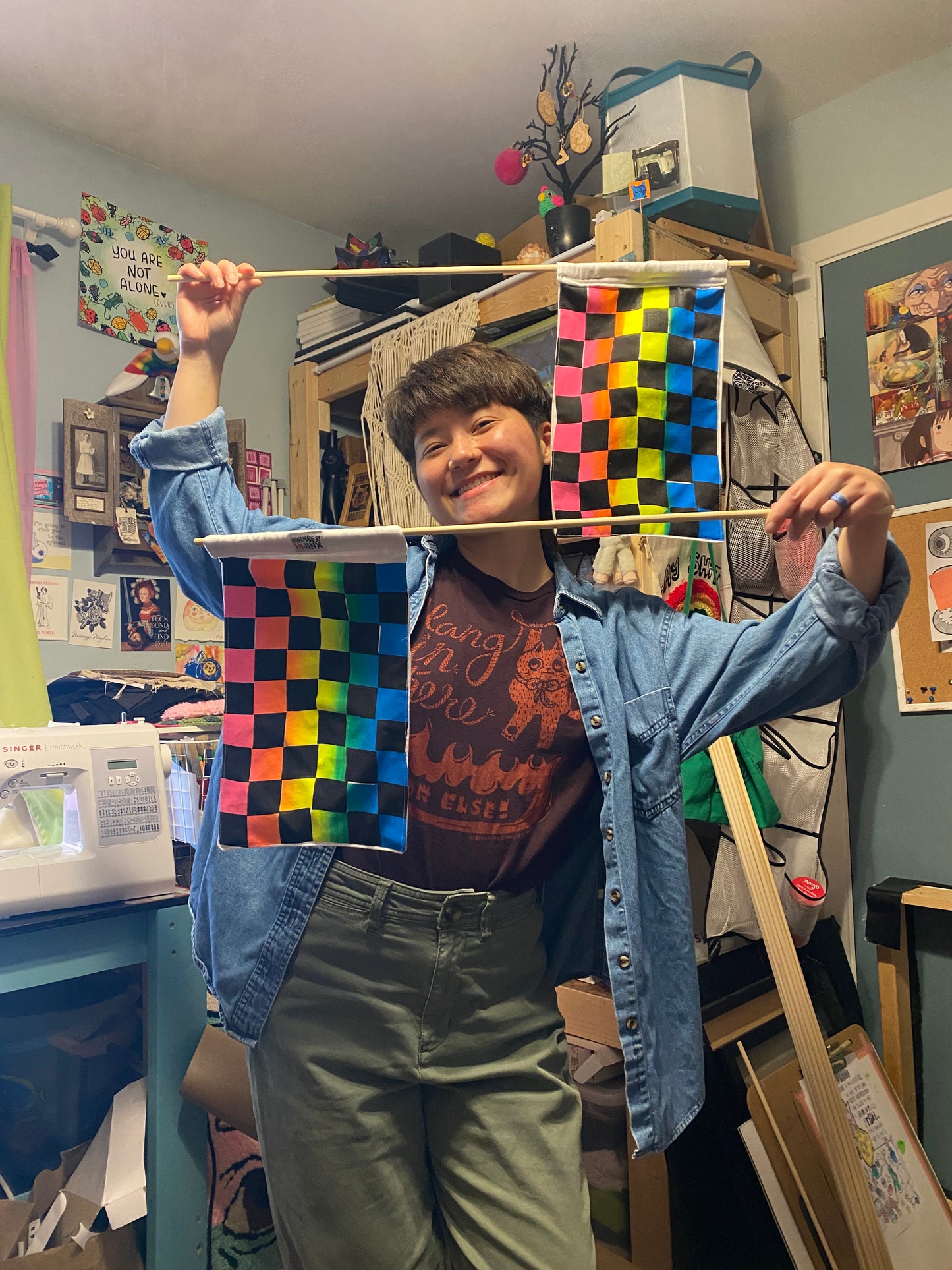
Hijinx’s new pride flag is a chequeered rainbow roll! 2-layer screen print on upcycled fabric (cotton sheet from the thrift store, I hope they had gay sex on it!) pulled by hand. Rainbow roll gradient with pink, yellow, and light blue with a black second layer. Sewn and mounted on a dowel with a twine hanger. Handmade by Hijinx tag sewn on the back. 

Chequeered Flag design

The Hijinx pride flag intentionally leaves out these colors of the progress pride flag: red, white, and navy blue. Historically and presently, the United States of America has not been kind to the queer community. Whether it is silencing us into submission, actively taking away our rights and autonomy, or shooting us down for being different, our story has a dark side. To represent those of us who have been silenced, either permanently through murder/suicide or indefinitely closeted for our own safety or those of us fallen victim to heteronormativity, the void of black squares fill half of the design. I greatly appreciate the idea behind adding the pink, white, light blue, black, and brown triangular stripes to the progress flag to represent the trans and BIPOC members who have traditionally been silenced even more so than others. However from a design standpoint, that’s just too many colors for a flag. The black checkers blocking out the bright colors is a reminder of the pain, struggles, fear, backlash, and hatred we all may face but especially those of us with intersectional identities such as queer and BIPOC, trans, disabled, immigrant, neurodivergent, etc. 

The reduction of the rainbow color palette was both a practical choice and an artistic one. In screen printing, each color requires its own screen/stencil. To achieve a classic pride flag rainbow would require 6 screens: red, orange, yellow, green, blue, and purple. While this is technically doable, it’s not practical for producing affordable flags. Utilizing the aptly named technique called the rainbow roll, I mixed the three main colors pink, yellow, and cyan on one screen to create the gradient effect. When you mix together pink and yellow, you get an orange transition. When you mix together yellow and blue, you get a green transition. The fluid nature of screen printing inks will blend the colors together uniquely during the printing process, effectively creating a slightly different gradient for each flag. For example, the first print is usually not blended much and the ink gradually becomes more blended until you have to add more ink and start over again. To me, this is a beautiful visual representation of the fluidity and uniqueness within the queer community. 

A friendly note on the term queer: My personal experience as a queer person has been incredibly fluid (it was just a phase and that’s OK). Here’s a quick recap of my sexual orientation starting in 8th grade up until now: straight, bi, straight, gay, straight, gay, lesbian, bi, straight, gay, bi, pan, bi, pan, queer. My journey has also involved questioning the gender binary as a whole. This has changed my relationship with the term ‘bisexual,’ an identity I was comfortable with for a while. The term queer for me is all-encompassing and leaves room for flexibility. While I recognize that this is not a term all members of the LGBTQIA+ community are comfortable with, saying LGBTQIA+ is a mouthful (not the fun kind) and it's a bit silly and honestly hard to keep up with adding or shuffling letters in the acronym to (justifiably) make people feel seen. Thus I have settled for the umbrella term queer. Being queer is just that. I am recognizing that I am different than the heteronormative, cisgender, monogamous mold and I embrace and celebrate this difference. I do see the value in micro-labels and wanting to find the identity that fits you just right but on my journey right now, I choose queer. 

This reduction in color palette for the first layer mirrors the colors of the pansexual pride flag. While pansexuals are a part of the community, of course not all queer people identify as pansexual. However, the idea of pan (meaning all or every) is something that I find to be important. For one reason or another, there is a lot of division outside of and within the queer community. Separating ourselves is very natural and can be a form of much needed protection or self-expression. On the other hand, we live in very divided times right now and finding safety and support with each other while allowing room for conflict, conversation, and growth, is much more valuable than further segregating ourselves. Within every and all person is a dynamic, fluid, unique, problematic, wonderful, ever-changing critical thinker. United we stand, divided we fall. Y’all means all. Etc!

The checker shapes are made by cutting up pieces of paper into squares and taping them down on a transparent film to create the stencil. This handmade process results in a checkered pattern that is a little wonky. The intended structure of a grid pattern is  uniformity, each square is precisely the same as the next. Wonkifying (that’s the technical term) the checkers is another representation of the strange, the weird, the freakish fitting together despite none of us exactly 'fitting the mold.’ 

View full details